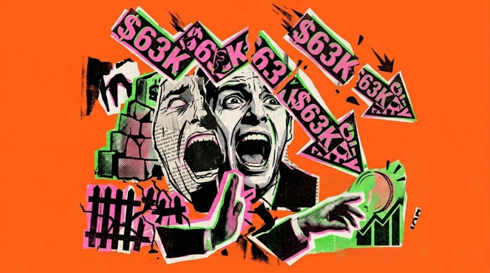
Extreme Fear at $63K: Is Bitcoin's Drop a Warning Sign or a Hidden Opportunity?

But here's the thing: prices and emotions tell only part of the story. To really understand whether Bitcoin is "broken" or simply "on sale," we need to look at the fundamentals — the actual usage, network health, and valuation metrics behind the price chart. That's what "techno-fundamental" analysis means: combining technical chart signals with the underlying data that drives long-term value. Let's break it down in plain language, with the data charts to back up every claim.
1. The Mood on the Street: Why Everyone Suddenly Feels Scared
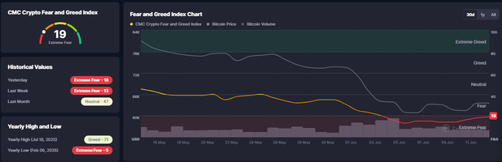
The Fear & Greed Index is built from things like price volatility, trading volume, social media sentiment, and market dominance. Right now, every one of those inputs is pointing toward fear.
Looking at the chart above, Bitcoin's price (gray line) has been sliding steadily since late May, while the Fear & Greed line (orange/red) has dropped almost in a straight line from the "Fear" zone into "Extreme Fear." Notice the yearly low for this index was 5 (recorded back in February), so 19 isn't the worst it's ever been — but it's close to levels historically associated with capitulation, the point where panicked sellers dump their coins regardless of price.
For contrarian investors, "Extreme Fear" readings have historically lined up with good long-term entry zones, simply because most of the emotional sellers have already exited.
2. Altcoin Season Index: Money Is Quietly Rotating
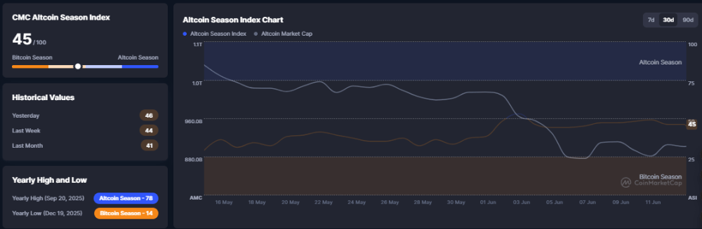
The Altcoin Season Index currently reads 45/100, sitting almost exactly in the middle between "Bitcoin Season" and "Altcoin Season." A week ago it was 44, and a month ago it was 41 — so there's been a very slight drift toward altcoins, but nothing dramatic.
What's more telling is the chart itself: total crypto market cap (the gray line) has been falling sharply since early June, while the Altcoin Season Index itself (orange line) has stayed relatively flat. In simple terms, the overall market is shrinking, but altcoins aren't being sold off disproportionately compared to Bitcoin. This suggests the current downturn is a broad "risk-off" move affecting the entire crypto market, not something unique to Bitcoin's fundamentals.
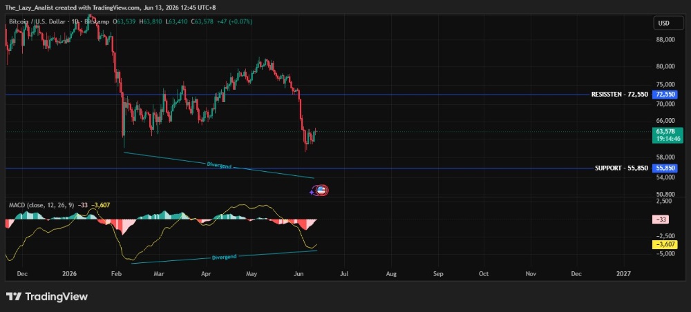
3. Price Action: A Textbook Bearish Setup, But With a Twist
Looking at the daily BTC/USD chart above, the picture is fairly clear:
· Resistance sits around $72,550 — the price has tried and failed to break above this zone multiple times since February.
· Support sits around $55,850 — a level that has held since the sharp drop earlier in the year.
· The price recently fell hard from the $72K resistance area down to roughly $58,000–$60,000 before bouncing slightly to the current $63,578 level.
The most interesting detail is what's happening on the MACD indicator (the momentum panel at the bottom of the chart). While the price has been making lower lows, the MACD has been forming higher lows — this is called a bullish divergence (marked "Divergend" on the chart). It doesn't guarantee a reversal, but it often signals that selling pressure is starting to weaken even while the price keeps falling. Combined with the "Extreme Fear" reading above, this divergence is one of the more constructive signs on an otherwise gloomy chart.
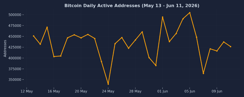
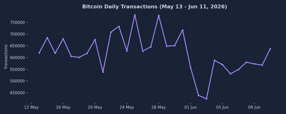
4. On-Chain Activity: Is Anyone Actually Using Bitcoin?
This is where "fundamental" data becomes useful. The charts below are plotted directly from the last 30 days of Bitcoin network data.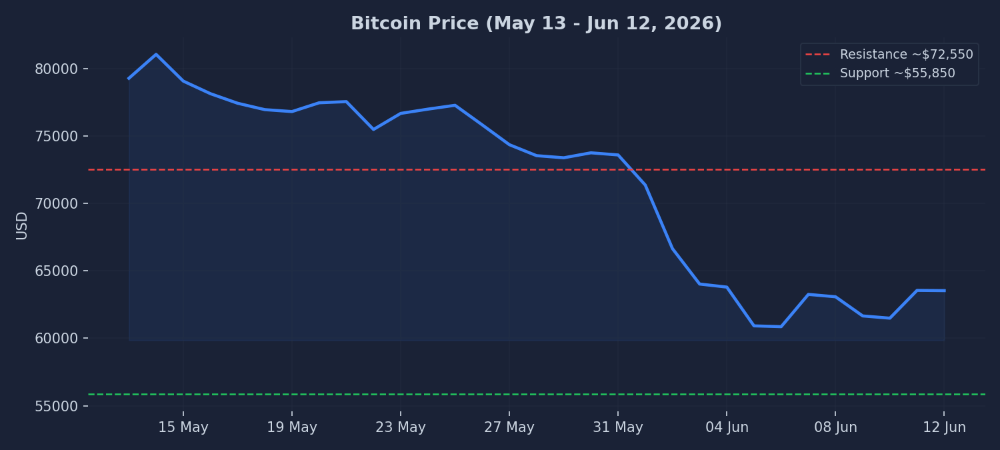
Despite the price crash, Daily Active Addresses have bounced between roughly 340,000 and 505,000 throughout the entire period, without any sustained collapse. Even during the worst of the price drop in early June, activity stayed within its normal range — there's no visible "death spiral" in usage.
Daily Transactions ranged between about 425,000 and 782,000, again showing healthy day-to-day usage rather than a network going quiet. If anything, some of the highest transaction-count days occurred during the price decline (late May), suggesting active participation, not abandonment.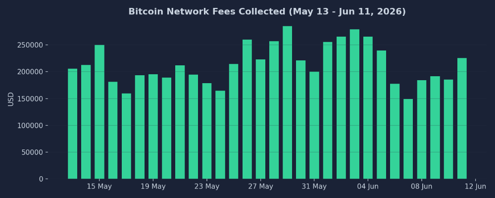
In other words, while the price of Bitcoin dropped roughly 20% from its mid-May level to its early-June low, the network itself kept humming along at a normal pace. This is an important distinction: a price crash caused by panic selling on exchanges is very different from a price crash caused by people abandoning the network. The data here points more toward the former.
5. Puell Multiple: A Classic "Undervalued" Signal
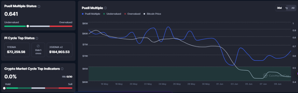
Right now, the Puell Multiple sits at 0.641, squarely in the "Undervalued" zone of its typical range, as shown by the gauge on the left. Looking at the chart, this metric (blue line) has been trending down steadily since late May, tracking the falling price (white line). Historically, readings below 0.7–0.8 have often (though not always) coincided with periods that, in hindsight, turned out to be attractive accumulation zones rather than the start of a prolonged bear market.
It's worth pairing this with the Pi Cycle Top indicator (middle panel), which is used to flag potential market tops. Currently, the 111-day moving average ($72,259) remains well below the 350-day moving average x2 ($184,903), and the two lines have not crossed — meaning this particular "top" signal is nowhere close to triggering. Similarly, the broader "Crypto Market Cycle Top Indicators" dashboard (right panel) shows 0 out of 30 signals triggered (0.0%). None of the classic euphoric-top warning signs are currently flashing.
6. Developer Activity: A Longer-Term Concern
Here's where the picture gets more mixed, and arguably more important for long-term investors than any single price chart. These charts cover developer activity across the broader crypto ecosystem (not Bitcoin alone, but the industry as a whole, based on GitHub data).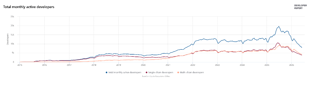
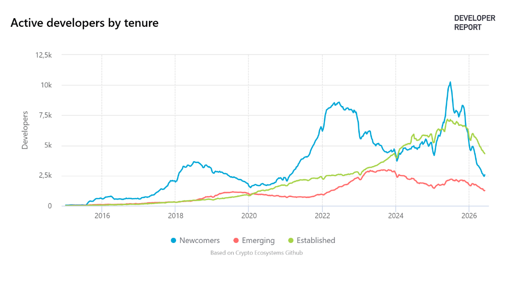
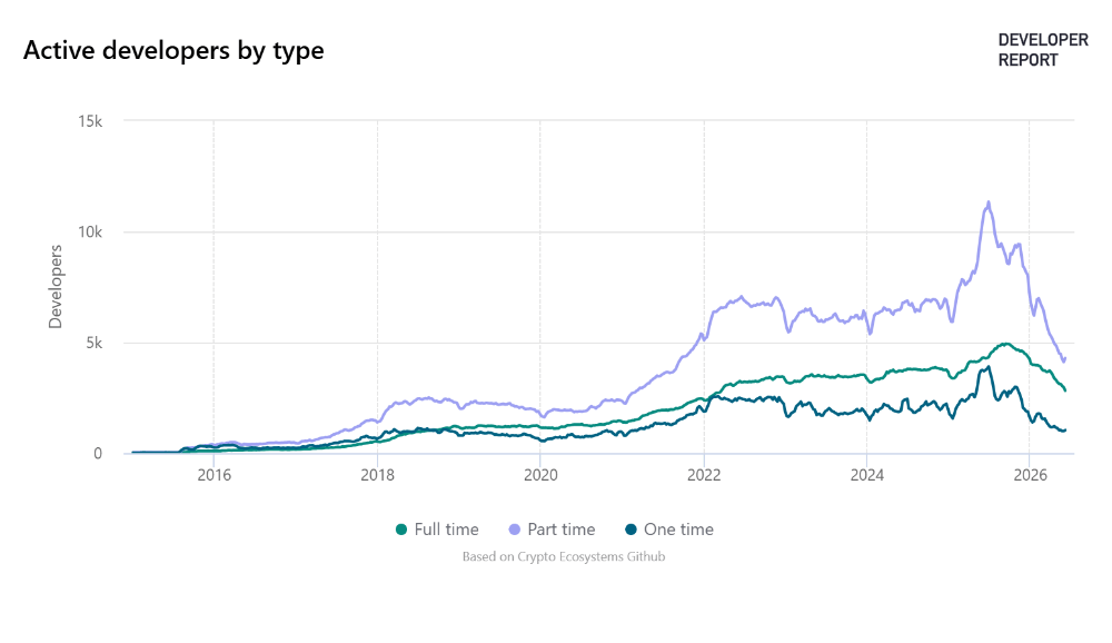
This downtrend in builder activity started well before the recent price crash, suggesting it reflects a broader cooling of speculative interest and funding across the industry over the past year, rather than a reaction to short-term price moves. It's a slower-moving, structural signal — and one worth watching, since sustained periods of low developer interest have historically coincided with quieter "bear market" phases for the broader ecosystem.
Conclusion: Fear Is High, But the Foundations Look Steadier Than the Price Suggests
Pulling all of this together, Bitcoin's current situation is a study in contrasts. On one hand, sentiment has collapsed into "Extreme Fear" (19/100), the price has broken down from its $72,550 resistance toward the $58,000–$63,000 range with a ~20% monthly drawdown, and developer activity across the industry has been declining for over a year — none of which are bullish on their own.
On the other hand, several signals suggest the drop may be more about emotion and short-term positioning than a fundamental breakdown. On-chain usage — active addresses, transactions, and fees, all shown in the charts above — has remained healthy and within normal ranges throughout the decline. The Puell Multiple sits at 0.641, in undervalued territory, and none of the classic market-top indicators (Pi Cycle, 30-signal Market Cycle dashboard) are anywhere close to triggering. The MACD's bullish divergence on the price chart hints that selling momentum may be fading even as price makes new lows.
None of this is a guarantee of what happens next — fear can deepen before it turns, and the $55,850 support level remains the key line in the sand to watch. But for those taking a longer-term view, the combination of "Extreme Fear" sentiment alongside steady network usage and an undervalued Puell Multiple is the kind of setup that, historically, has often rewarded patience more than panic. As always, this is an observation of the data, not financial advice — do your own research and manage your risk accordingly.
SOURCE DATA : https://defillama.com/token/BTC
SOURCE DATA : https://cryptoquant.com/asset/btc/summary