The King of All Charts: Why Whales Ignore Short-Term Noise and Follow the Weekly Trend

Assalamu Alaikum, friends. How is everyone doing? I hope you are all doing well.
By looking at the title, you have probably already understood what we are going to discuss today.
Now, when we do chart analysis in trading, everyone does it—from retail traders to the biggest whales.
Have you ever wondered why ordinary or retail traders mostly look at short-term charts and do scalping, while the big whales trade on the Weekly chart for the long term?
Today, that is exactly what we are going to discuss.
So, let’s dive into the discussion.
Monthly Chart
One of the major long-term timeframe charts is the Monthly chart.
First, let’s talk about how it works.
Each candle or price action on the Monthly chart is formed based on the average price over the past 10 or 12 years.
In other words, from the opening of a candle to its closing, it shows the overall average price calculated from the previous 10 years.
Many people think that one candle on the Monthly chart represents the average price of one month.
According to this view, that is completely wrong.
The reason it takes one month for a candle to close is because it presents the average price calculated from the previous 10 years.
There are usually very few retail traders on the Monthly chart.
So panic selling and market instability are also very low—around 5%.
The most surprising thing is that many technical tools become much more accurate on this chart and provide more reliable signals.
However, the big whales, as well as exchanges, governments, and countries around the world, do not follow the Monthly chart.
They follow the Weekly chart.
Why?
Let’s go one step deeper.
Weekly Chart
This is an even more powerful long-term chart than the Monthly chart. Every candle, price action, or market movement on this chart, from the opening to the closing, is based on the average price of the past 5 years. In other words, every candle is formed according to the average price over the previous 5 years. That's why it takes one week for a candle to close.
Now, you might be wondering, if the Monthly chart provides even more information than the Weekly chart, then how can the Weekly chart be more powerful? Well, this is where the real twist comes in.
What twist?
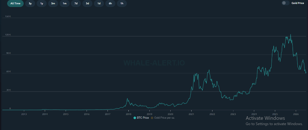
Look, BTC follows a specific cycle that happens every 4 years. In other words, every 4 years, BTC tends to make a strong reversal and aims to break its ATH. Now think about this for a moment. A single candle on the Monthly chart represents the average of the past 10 years. You might say that one candle there also includes the 4-year reversal. That's true in theory, but in practice, it's a little different.
The Monthly chart shows the complete 10-year average in a single candle. So, does it show each 4-year reversal separately? Of course not. On top of that, one candle includes two different 4-year reversal cycles, which makes them harder to identify.
But since the Weekly chart is based on the average of the past 5 years, it becomes much easier to identify that 4-year reversal or cycle within a single candle. As a result, making the next decision becomes much easier. Every price action shows much more clearly what the market is likely to do next.
On top of that, the accuracy of technical tools becomes even better. That's because most of these tools were designed to calculate and analyze based on this 4-year reversal or cycle. So, even though the Monthly chart may seem more accurate in theory, in practice it is less suitable and less effective.
That's why whales and major institutions always follow the Weekly chart. If you want, you can check Whale Alert or other similar platforms. You'll see that most of them give the Weekly chart the highest priority as their main chart.
Just like the Monthly chart, only around 5–10% of traders on the Weekly chart are retail traders, so volatility and panic selling are much lower. Because of that, using a powerful combination of three tools makes it possible to make decisions based on accurate and reliable information.
Now, let's look at which chart most retail traders use the most.Short-Timeframe Charts or Scalping Charts
Retail traders usually trade on short-timeframe or scalping charts. Some of the most popular short-timeframe or scalping charts include 1 hour, 2 hour, 45 minute, 30 minute, 10 minute, 5 minute, and 1 day charts.
Let's start with the 1-hour chart. The 1-hour chart usually shows information based on the average price of the past 1 month. In other words, everything from the opening to the closing of a single candle is based on the average of the previous 1 month. That's why it takes about 1 hour for a candle to close on this chart.
Now, since one candle represents the average of only 1 month, there is no way to identify the 4-year cycle from it. That's because it doesn't show the average of 4 years. As a result, even small BTC pumps and dumps look like huge market moves on these charts.
The same thing applies to all the other short-timeframe charts as well. So, by now you've probably understood the biggest downside of short-timeframe charts.
On top of that, these charts contain less real information and much more fake signals and volatility. That's because these charts are filled with regular traders who enter the market hoping to become rich overnight because of greed. Most of them don't really understand how candle calculations work.
So, many of them think, "The long-term chart takes a long time to form one candle, but the short-term chart creates many more candles in less time."
These people believe that the more candles there are, the more profit they can make. In other words, they think they'll make twice as much money on short-term charts compared to long-term charts.
But what they don't realize is that 100 candles on their short-term chart are equal to just one candle on a long-term chart.
Then, hoping to make even more money, they enter the leverage and futures markets. As a result, even small pumps and dumps in the long-term, or real market, create a huge impact on their charts, causing them to panic sell.
That's why, on these charts, greed and emotions influence the market more than the actual market data. And because of that, even small events create huge volatility on these charts.
An even more serious issue is that because there is less real information and much more volatility caused by panic selling, technical tools also lose their accuracy. In other words, they become much less reliable at giving correct trading signals.
Final Thoughts
Trading is a game of patience. Patience is the most important weapon here. And if it's the Bitcoin market, then patience is even more important.
Don't let greed take over. Big whales and giant companies are buying BTC with confidence by following long-term charts like the Weekly chart. The reason is simple—they have patience.
On the other hand, ordinary people are driven by greed and trade on charts where, in reality, they gain nothing meaningful. They only end up with fear, mental stress, false hope, and financial loss.
At the end of the day, the rich become richer, while the poor become poorer. Haven't you often heard people ask why poor people never become rich? One of the biggest reasons is impatience and greed.
Another major problem is that they simply don't know. Because of that, they fall into the trap of fake news that spreads greed or fear. As a result, they lose everything simply because they lack knowledge.
So, we need to stay away from all of this. Especially in the BTC market, there is no substitute for patience. To understand the strategies of the big whales and avoid their traps, we need both patience and knowledge, and we should hold BTC in the spot market by following long-term charts like the Weekly chart.
Only then can you become successful. Otherwise, mental stress and fake illusions will slowly consume you.
So, let's all choose patience and hold Bitcoin for the long term by following long-term charts.
That's all for today. I'll see you again in another special discussion. Until then, take care, everyone.