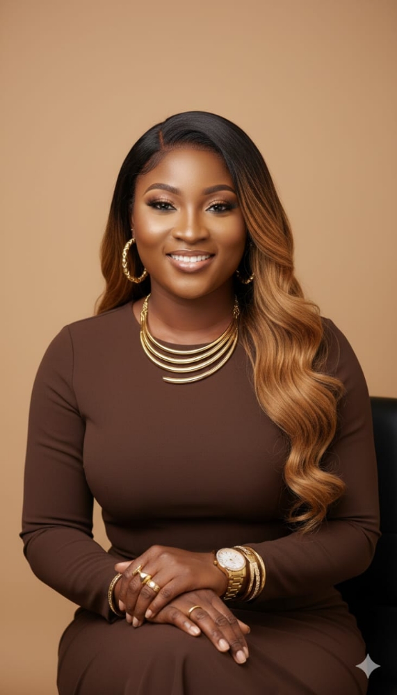
Understanding the Basics of Color Theory in Fashion
Color is more than a visual experience; it’s a silent communicator that evokes emotions, defines moods, and tells stories. In fashion, the strategic use of color can transform a garment into a statement piece or a timeless classic. Understanding the principles of color theory allows designers, stylists, and enthusiasts to create harmony, balance, and visual appeal in their work. 
Below, we delve into the fundamental concepts of color theory in the context of fashion and explore how these ideas influence style and personal expression.
The Color Wheel: Foundation of Creativity
At the heart of color theory lies the color wheel, a circular diagram that categorizes colors into primary, secondary, and tertiary groups.
This tool is essential for understanding how colors relate to one another and how they can be combined effectively:
- Primary Colors: Red, blue, and yellow. These are the foundational colors that cannot be created by mixing other hues.
- Secondary Colors: Green, orange, and purple, formed by blending two primary colors.
- Tertiary Colors: Created by mixing a primary and a secondary color, resulting in hues like red-orange or blue-green.
The color wheel aids in identifying harmonious color combinations that resonate in fashion. For instance, pairing complementary colors—those opposite each other on the wheel, such as blue and orange creates dynamic contrast. Analogous colors, which sit next to each other on the wheel (e.g., green, blue-green, and blue), provide a more subdued and cohesive aesthetic.
Color Harmony in Fashion Design
Harmony in fashion is achieved when colors work together to create balance and visual interest.
Several approaches to color harmony can guide the selection of palettes:
- Monochromatic Schemes: Using variations of a single hue, including its tints, tones, and shades, to create a sophisticated and minimalist look.
- Complementary Schemes: Combining opposite colors for high contrast and vibrant energy.
- Triadic Schemes: Using three colors evenly spaced on the wheel, like red, yellow, and blue, to generate a balanced and playful effect.
- Split-Complementary Schemes: A variation of complementary schemes, involving one base color and two adjacent colors to its complement. This adds complexity while maintaining harmony.
In practice, a designer might use a triadic scheme for a youthful, energetic collection or opt for a monochromatic palette to evoke elegance and simplicity. Stylists often lean on these principles when curating outfits for different occasions.
Psychological Impact of Colors
Colors carry inherent psychological meanings that influence how they’re perceived and the emotions they evoke.
Fashion, being a personal and cultural expression, heavily relies on these associations:
- Red: A symbol of passion, power, and confidence. Often used in statement pieces like evening gowns or tailored suits.
- Blue: Denotes calmness, trust, and stability. A staple in business attire and casual wear.
- Yellow: Represents joy and energy, frequently used in summer collections or as an accent color.
- Black: Timeless and versatile, black conveys sophistication and mystery, dominating both casual and formal wear.
- White: Associated with purity and simplicity, often used in bridal fashion or minimalist aesthetics.
- Green: A signifier of nature, balance, and freshness, widely used in eco-conscious and contemporary designs.
Understanding these emotional cues allows designers and consumers alike to communicate messages through their clothing choices. For example, a red dress might exude boldness for a gala, while pastel hues in a spring collection can evoke a sense of renewal and optimism.
Practical Applications in Styling and Wardrobe Planning
Color theory is not confined to runways; it’s a practical tool for everyday styling. By leveraging these principles, anyone can build a versatile and visually appealing wardrobe.
Here are key considerations:
- Skin Tone and Undertones: Colors can complement an individual’s natural complexion. Warm undertones often pair well with earthy colors like gold and olive, while cool undertones shine in jewel tones like sapphire or emerald.
- Occasion and Seasonality: Bright and vibrant hues are ideal for casual and summer settings, while muted tones dominate formal and winter wardrobes.
- Statement vs. Neutral Pieces: Incorporating neutral colors (e.g., black, white, beige) provides a base for integrating bolder statement colors, creating a balanced ensemble.
Bullet points for wardrobe building:
- Invest in foundational pieces in neutral tones for versatility.
- Use accessories—scarves, bags, jewelry—to experiment with bold colors.
- Mix textures and patterns within the same color family for depth and interest.
Fashion stylists often employ these techniques to craft looks that are not only visually stunning but also tailored to the client’s personality and lifestyle.
Conclusion
The art of mastering color theory in fashion lies in understanding its scientific roots and applying them creatively. Whether you’re a designer aiming to craft a cohesive collection or an individual curating your wardrobe, color is a powerful tool for self-expression. By harnessing the principles of the color wheel, embracing harmony, and considering the psychological impact of hues, you can elevate your fashion choices and communicate your identity with confidence.
References
- The Role of Color in Fashion Design
- Color Wheel Basics and Applications
- Psychology of Colors in Branding and Fashion
- Guide to Monochromatic Outfits
- Understanding Skin Undertones for Wardrobe Choices
- The History and Science of the Color Wheel
- How to Mix and Match Patterns and Colors
- Seasonal Color Palettes Explained
- Eco-Friendly Fashion and Color Trends
- Tips for Building a Capsule Wardrobe


