Visual Patterns in Blockchain Analytics: Making Sense of Transaction Flows
Blockchains are public ledgers. Every transfer whether of tokens, smart-contract calls, or value sent from one wallet to another is recorded. Those individual transfers link address to address; over time they form chains, webs, and patterns.
Given the sheer size of modern blockchains (millions of transactions, many active addresses), it becomes difficult to see what’s happening just by reading raw data. That’s where visual patterns come in: using graphs, flow charts, node‐link diagrams, Sankey diagrams, time series, heat‐maps, etc., to make transaction flows visible.
Visualizing transaction flows means mapping who sends what, when, and where. You see which addresses (or clusters of addresses) are active, how funds move across smart contracts, which paths funds tend to follow, and where anomalies appear (for example: large, sudden transfers, or looping transactions typical in money laundering).
Why Scalability and Performance Matter in Visual Patterns
Producing good visualizations of transaction flows is not just about prettiness. Two things must hold:
- The system must handle very large volumes of data without choking.
- The visualizations must update in a timely fashion if they need to reflect recent or live activity.
If your analytics system can only deal with a few thousands of transactions, it won’t reveal interesting patterns in a blockchain that might be processing millions per day. If you wait hours to refresh a visualization, you may miss short‐lived fraud, flash loans, or other rapid movements.
So scalability (handling growing size of data, many chains, many transactions, many users) and performance (speed of querying, rendering, updating visuals) are central to making visualization useful, not just decorative.
Key Visual Patterns in Blockchain Transaction Analysis
Here are some common visual tools and the patterns they reveal:
- Transaction graphs / node‐link diagrams: Addresses are nodes; transfers are links. These reveal clusters (many transactions linking a few nodes), hubs (nodes with many in‐ or out‐links), chains (sequential transfers), loops. Useful for spotting central players (exchanges, mixers), detecting fraud or anomalous behavior.
- Flow/sankey diagrams: Show the thickness of flows between entities. Good when large volumes move through certain paths. E.g., showing how funds move from many addresses into a smart contract, then split out to various others.
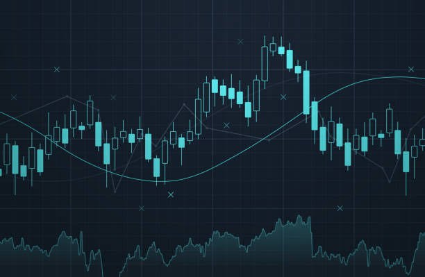
- Time series and heat maps: Plot transaction volume (or value) vs time. Helps you see regular cycles, spikes (maybe a hack, a drop or surge), periods of low activity.
- Behavioral / anomaly pattern visualizations: Outliers pop up (e.g. a wallet that suddenly sends or receives way more than usual). Patterns like recurring small transactions, or mixing services’ behavior, can be revealed.
- Graph‐based visualisation with attributes: Nodes carry labels (type of address: exchange, user, smart contract; risk score; category) and those labels help you see more meaning: you can color nodes differently, size them by volume, etc.
Techniques for Achieving Scalability and High Performance
To support visualizations that remain useful as blockchains grow, analytics systems use several methods. I’ll outline the ones that work well, along with trade‐offs.
1. Data preprocessing, indexing, normalization
- Raw blockchain data is messy: contracts encode behavior, logs are complex, value transfers are mixed with metadata. Preprocessing means decoding smart contracts, extracting only relevant events, normalizing fields (timestamps, token decimals, etc.).
- Indexing: building indexes (by address, by transaction time, by token, etc.) so lookups are fast.
- Clustering / entity resolution: grouping pseudonymous addresses that behave together (e.g. belong to same wallet service) reduces noise, makes visuals more meaningful, and improves performance (fewer nodes to render or query).
2. Partitioning data and parallel processing
- Sharding (splitting up the ledger or state into parts) or dividing data by time slices or by chain helps. When only a part is needed (say, last 24 hours, or one chain), you don’t need to process everything.
- Parallel pipelines: ingest data, transform, aggregate, serve to visual layer. Many operations (summaries, aggregations) can run in parallel.
3. Sampling or summarization
- For huge datasets, showing every transaction can overwhelm both the system and the human eye. It’s useful to sample or aggregate transactions: group transactions into batches, or summarize flows over time or between clusters rather than individual addresses.
- Summaries may lose some detail, but preserve patterns. For example, instead of showing 10,000 small flows between many addresses, show the top 100 by volume, or aggregate by region or type.
4. Efficient visualization rendering
- Use graph layouts that scale (force‐directed layouts are nice but slow for tens or hundreds of thousands of nodes).
- Use incremental rendering: progressively refine the visual as data loads or as user zooms.
- Use viewports, zooming, collapsing clusters: hide details until needed.
5. Real‐time or near‐real‐time pipelines
- Some use cases (fraud detection, monitoring, compliance) need current info. Systems must have pipelines that capture new blocks, process them quickly (decode, index, enrich), update aggregates, and feed visual dashboards.
- Technologies like stream processing (Kafka, Flink, etc.), real‐time database engines, optimized data storage formats (columnar stores, partitioned datasets) help here.
Trade‐Offs & Constraints
While scalability and good performance are achievable, there are trade‐offs:
- Detail vs speed: The more detail you show (edge weight, individual address behavior, small flows), the slower rendering/queries become. Sacrifice detail to gain speed or responsiveness.
- Resource costs: Storage, compute, memory. Keeping full histories, many indexes, high resolution of data costs money.
- Visual clutter vs interpretability: Dense graphs may be unreadable. Too many nodes, edges, or colors can confuse. The challenge is designing visuals that scale visually as well as technically.
- Accuracy vs abstraction: Aggregation or sampling may hide anomalies. Preprocessing steps (e.g. clustering addresses) may err.
Case Studies or Examples
- In “Visualizing Dynamic Bitcoin Transaction Patterns,” researchers showed how force‐directed graphs (with large numbers of nodes and edges) reveal algorithmic behavior over time, spotting denial‐of‐service style transaction floods or suspiciously automated flows. PMC
- In the paper “Visualizing Blockchain Transaction Behavioural Pattern,” a graph‐based method lets users explore anomalous nodes (addresses behaving unlike others). They build general graph models for both Bitcoin and Ethereum, with graph queries so users can zoom in on behavior. ResearchGate
- TxAllo: this work addresses scaling by reducing cross‐shard transactions in sharded blockchains. It treats accounts and transactions as a graph, then allocates accounts to shards to cut cross‐shard traffic, which boosts performance. arXiv
What “Good Enough” Looks Like
If you are building a course, tool, or service around visualizing transaction flows, aim for these benchmarks:
- System can ingest and preprocess at least the last N blocks quickly (depending on chain) — say within minutes, not hours.
- Dashboards that refresh critical insights (volume flows, anomalous spikes) every few minutes.
- Ability for user to explore: filter by address type, time period, transaction type, and zoom in on clusters or paths.
- Graphs that stay legible even as data grows: clusters collapse, nodes that are minor fade, important ones standout.
- Performance metrics: query latency (how long until visuals update when filters change), rendering time, resource usage.
Conclusion
The story of transaction flows is hidden in mountains of data without visual patterns, most of it is opaque even to experts. The real power lies in making those flows visible, interactive, and fast. Scalability and performance are not optional; they’re what lets you move from curiosity to insight.
Every visualization technique, every optimization, every engineering trick exists so that you can spot what matters: who is moving large amounts, when things go wrong, where abnormal flows happen. If you build your visualization stack with that in mind fast preprocessing, smart indexing, sampling, real‐time pipelines you get more than pretty charts: you get the tools that alert, inform, and protect.
References
- Rischan Mafrur et al., Blockchain Data Analytics: Review and Challenges (2025). arXiv
- Samantha Jeyakumar, Zhe Hou, Andrew Charles Eugene Yugarajah, Marimuthu Palaniswami, Visualizing Blockchain Transaction Behavioural Pattern: A Graph‐based Approach (2023). ResearchGate
- Dan McGinn et al., Visualizing Dynamic Bitcoin Transaction Patterns (PMC). PMC
- “Step‐by‐Step Blockchain Analytics: A Practical Guide,” CelerData. celerdata.com
- “TxAllo: Dynamic Transaction Allocation in Sharded Blockchain Systems,” Yuanzhe Zhang et al. arXiv
- “NFTracer: Tracing NFT Impact Dynamics in Transaction‐flow Substitutive Systems with Visual Analytics,” Yifan Cao et al. (2024). arXiv
- “Gromit: Benchmarking the Performance and Scalability of Blockchain Systems,” Nasrulin, De Vos, Ishmaev, Pouwelse. arXiv
- Gerui Zhang, Xiongfei Zhao, Yain‐Whar Si, A Comparative Analysis on Volatility and Scalability Properties of Blockchain Compression Protocols (2023). arXiv
- “Blockchain Transaction Visualization: Mapping Distributed Ledger Activity,” Dev3lop blog. Dev3lop
- “Blockchain Analysis in Action: Real-Life Use Cases and Insights,” Ulam.io blog. ULAM LABS


