Data Literacy – Telling stories with Data
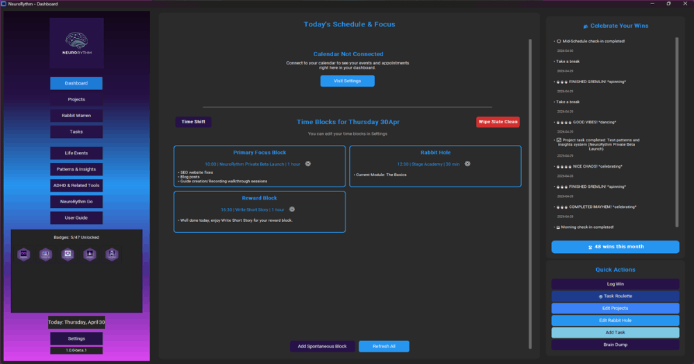
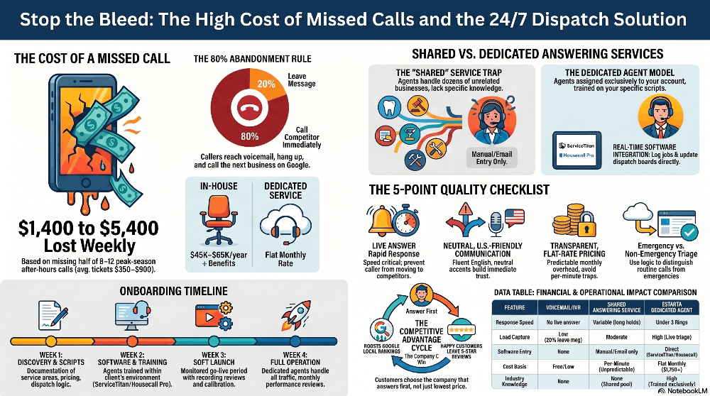
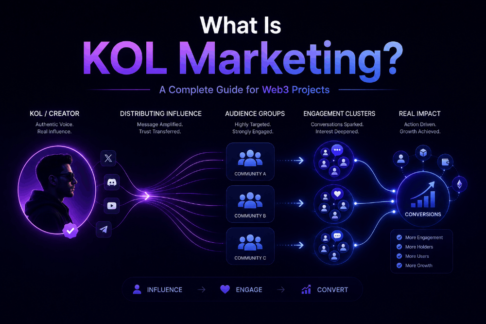
Have you even seen a visual that is so confusing, misleading and difficult to interpret? Whilst not exhaustive here are a few things to help you tell the right story with data.
Define the Problem
A lot of the time a poor visual results in a lack of understanding of the problem and a drive to inspire with colour and variety and fails to understand the experience of the user in interacting with the data.
What action do you want the user to take?
Whist there may be a few different purposes when creating visuals to tell a story be clear in what you want the user to do.
If you are delivering a marketing campaign, you may want to enhance the visual to put a particular product or feature in the best possible light but when communicating a company’s performance you want an unedited version of the metrics and highlight areas that require action. It is easy to develop visualisation but harder to deliver a meaningful visualisation that is actionable. Often the way data is displayed can create a misleading picture of performance that creates an action counterintuitive to what is actually required.
Select the right visual
A data visualisation is not all about trying to add as much colour, variety and different visuals to fill up a page it is essential to ensure the message you want to get across to your audience is clear, concise and relevant. There is enormous choice of visualisation in tools like excel and others, many of which are not needed. Try not to add a graphic in because you haven’t used it in a while, or because it looks good
Edward Tufte, says about visualisations “If the statistics are boring, you've got the wrong numbers.”,
don’t try to make the numbers look good by adding interesting visualisation add the right data.
Tell the story
We have all seen bad visualisation but here is a great example from Hans Rosling on the Health and wealth of nations. It is one of my most inspiring visualisation combined with story telling that is engaging, and yet simple to understand. It doesn’t try and add in additional complexity but uses a scatter plot, overlayed with a time series video that shows the changing health and wealth of nations over the last 200 years.
https://www.youtube.com/watch?v=jbkSRLYSojo
This is a must see for all aspiring data analysts and developers to ensure you develop the right content for your audience. If you want to build your visualisation skills check out Makeover Monday a weekly makeover where you learn how to create more effective visualisation
https://www.makeovermonday.co.uk
Final thoughts
Keep your visualisations simple, use the small amount of real estate on your page wisely and select the right visuals to tell your story.
References
[1] Hans Rosling 'Health and wealth of nations' (2010) https://www.youtube.com/watch?v=jbkSRLYSojo
[2] makeover Monday, https://www.makeovermonday.co.uk/


